-
Architects: Estúdio AMATAM
- Area: 1105 m²
- Year: 2016
-
Photographer:Invisiblegentleman

Text description provided by the architects. What is it to be MAIS (plus) FITNESS? Understanding the charisma behind one existing brand is to comprehend that what defines it is the people. It is the will to belong to this “tribe” that makes the people to join and want to belong to this fitness community. From this concept comes the motto for this new gym in Torres Vedras, a middle size city in the West region of Portugal. Our main challenge was the creation of a spatial image identity for this and future MAIS FITNESS gyms.

A tribe communicates by symbols and colors, and it was this language that we proposed to identify in order to affirm the identity of the MAIS FITNESS brand.
The new gym was to be settle in an existing building, so much of the formal exercise was to accept the characteristics of the existing and when possible adapt and reformulate it, so as to make the most of the spatial qualities in behalf of what we intended to transform this gym into.

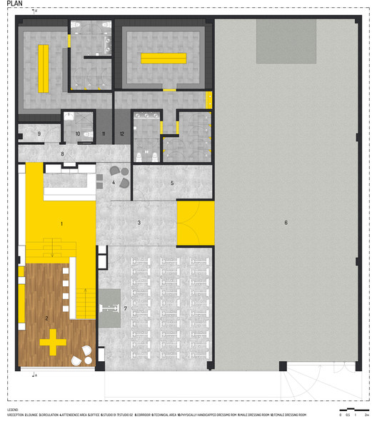
At the programmatic level, the task was simple. The charisma of MAIS FITNESS is associated with people’s positive energy, and the sharing of this energy in group classes with the maximum number of athletes. Thus, a XXL studio was mandatory - the bigger the better! The definition of the positioning of this space in the layout, as well as the existing access stairs to its interior, were the predominant factors in the program distribution. Placing the reception desk as a nuclear point of the circulation dynamics inside the gym was one of the requirements. Hence, its centrality, allow establishing relations with the lounge area, the studios, the office and service area, and even with the changing rooms.
For the creation of the brand spatial identity, we sought to explore concepts associated with its universe: elegance and energy, black and yellow, - and +. By exploring these elements in different intensities in spaces environments, chromatic compositions and graphic patterns, we intend to transmit an exclusive, coherent, contemporaneous and unique identity, inseparable from what MAIS FITNESS represents. The positioning of the brand dictated the remaining options. We avoided conveying a Low Cost design connotation, but rather a democratic premium. The environments of the spaces, as well as the choice of materials reflects this, elegance and good taste, with a touch of irreverence in the details. We believe that less is more, so we sought to take advantage of a sensible and just pallet of materials, in order to convey unity but also differentiation between the different uses of the gym.

CHANGING ROOMS
Changing rooms are one of the most preponderant features in assessing the quality of a gym. We intend to astonish by creating a space above everything contemporary, for a generation accustomed to look for new trends every day. The tones excel by elegance and touches of irreverence through graphical notes and the manipulation of the ceramics patterns. The male and female changing rooms are aesthetically the same, because bottom line, here there is neither men nor women, there are just people looking to be in better shape!

SOCIAL AREAS
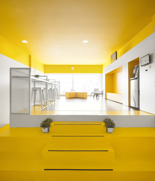
This is the gym core! This is where the sharing begins, where people discover complicity and make friends. This is where the MAIS FITNESS gym path starts and also where it ends. This is an agglutinating and central space, where conviviality is constant. How to demonstrate this centrality was the motto to structure this area. The application of a yellow paint on the pavement structures the entire route from the entrance to the reception, enhancing the brand environment and giving it preponderance. The yellow reveals itself in all the space, wandering between the walls, the ceiling, the furniture, contaminating with a contagious energy. The white and the gray end up doing the right balance with the yellow, passing an atmosphere of sophistication. Graphically, another layer was added, which was designed to highlight - through the graphic symbolism of the plus word (+) - motion, directions and the energy as a preponderant element inside the gym, as if it were a tactile intensity meter!


In the lounge area, the ambience becomes whiter, giving preponderance to the fabulous view and the green elements that are randomly placed, stimulating a certain emotional relaxation and well-being, combined with the comfortable and relaxed furniture.

CORRIDOR
With so much energy everywhere, there was the need to create neutral and decompression spaces. That is achieved by this corridor, which ends up being the point of preparation for a new workout session, or to recover from the last workout. It is always a point of passage between energetic moments. White is the dominant color. The visual effect created by the mirrors leads us to the infinity.

SPINNING STUDIO
This type of trainning transpires speed, movement, vertigo .... And it was with these principles that the design strategy for this studio was defined. The scenic effect of multiplication created by the mirrors, which create a feeling of infinity, resembling a vortex, intensifies the sense of those who are pedaling towards something. To make this effect more dramatic, lines were painted to emphasize the movement and the will of those who intend to reach the goal they set himself up. There is also some aura of worship space associated with the graphic elements, which were intended to be explored in the creation of a certain mystique associated to this particular training sessions.


FITNESS STUDIO
This is MAIS FITNESS worship place. The engine of all the energy. Here the intensity goes up to the limit. So we did not feel the need for visual excesses. We sought to make the space more welcoming through the painting of the ceiling and part of the walls in gray, due to its large vertical dimension, and we bet in emphasizing the stage presence through the horizontality of the white surfaces. Through the application of a glass color vinyl film on the entrance porch, with unique characteristics at the chromatic level, it is intended to create a unique element of surprise, capable of adding more dynamics to the training sessions.

UNDERGROUND SPACE
Here comes MAIS FITNESS darker side. A space with a different energy.... More corrosive ... a space to break down barriers and limits, to go further. To struggle with our inner selves, in search of perfection. A dark, intimidating, but challenging environment. Having in mind fighting rings as a starting point reference for the design, the nylon mesh was applied to create the boundaries for different spaces. The presence of the yellow color makes us never lose the notion that we continue inside the gym, and that only you need is to follow the color to return to the light!


